How to write for the way your coworkers actually read
By Aer Parris
Some weeks we tackle the Big Questions about work and life. Some weeks we get super tactical with tips and advice you can apply right now. This is one of those latter weeks.
On an async-first team, everyone is a writer. Relying on written communication may get push back as slow and inconvenient, but what's fastest and most convenient in the moment rarely produces the best outcome.
Creating a culture of writing has all sorts sorts of knock-on benefits for team productivity:
It creates a paper trail that people can search through and learn from later.
It clarifies your thinking on complex issues.
It generates new ideas and helps you make connections you hadn't thought about before.
I can't count the number of times I've started drafting a Twist thread on a thorny issue only to have completely changed my mind by the end of writing it. Or started asking for help only to solve my own problem before I even hit send.
But one of the biggest barriers to async-first work is that people won't take the time to read what you've written (hence the persistence of information-only meetings as a tool to force attention). Luckily, that's something you have (at least some) control over.
In this week's newsletter (a republish from Ambition & Balance), product marketing genius Aer Parris lets you in on all the science-backed tricks of the digital marketing trade to make your writing more readable – with actual examples to show you those tips in action.
If you find Aer's advice as helpful as I did, consider sharing it with your team.
Until next time,
Becky and the Twist team
How many times have you had a coworker ask you a question you’d already answered in an email?
It’s easy to blame it on sheer laziness, but the truth is your teammates are drowning in information. Between the barrage of messenger pings, document updates, and text messages — not to mention the mind-boggling average of 121 emails a day — the average knowledge worker is just trying to keep their head above water. If they took the time to read every word they’re sent, they’d never get anything done.
Luckily, there are people in the world whose job is to write words that grab people’s already overloaded attention. Those people spend mountains of time and money on research to understand how people process words online — and, better yet, what makes people stop mid-scroll and take action. They don’t just write words, they design them based on data.
Those people are called marketers. And you can steal their hard-won secrets to improve your own memos, emails, messages, reports, and more.
We’ve distilled those mountains of marketing research into proven tips — with real-life examples — that will help you write words your teammates actually read. Applying these techniques will help your coworkers scan for meaning, do a deep dive on what’s most relevant to them, and take action so your team can get work done.
Begin with the end in mind
Pro writers who work on apps and websites know that an intuitive interface often comes down to designing a digital experience backward. Amazon uses this approach, starting new initiatives by writing an imaginary pitch of the final product to the customers. If it doesn’t seem clear to people outside the team or doesn’t sound interesting or exciting, Amazon designers scrap the idea and try again.
So how does that apply to writing a business email? By beginning with your end goal in mind, you can actually figure out what to include and, more importantly, what not to include. (More on that later.) Start by asking yourself these questions about your readers:
- What problem am I trying to solve?
- Who is my audience?
- What are their needs?
- How could this communication fail?
- How can I make this message simpler?
- What can I delete?
- What assumptions am I making?
- What does success look like?
Front-load the important stuff
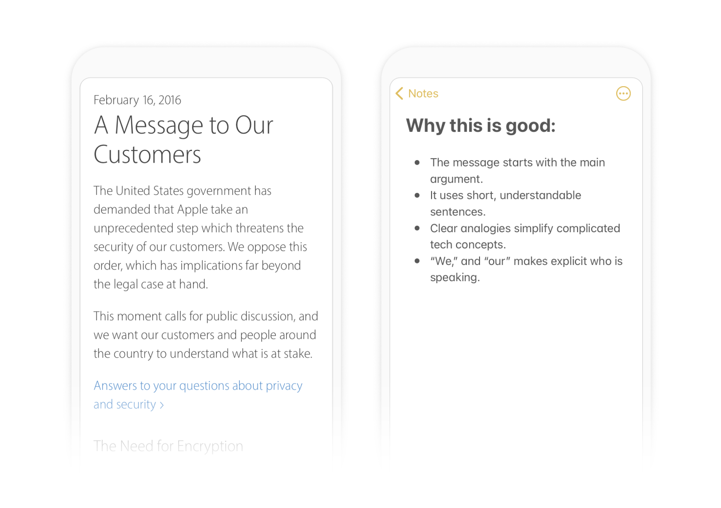
Research shows that most people leave websites in the first 10 seconds. We’re hoping that your teammates don’t have the same bail rate, but it’s still essential to get to the point.
To solve the problem, professional marketing writers borrow a technique from journalism called the inverted pyramid. That means the most critical information in news stories goes at the top, while the rest follows in descending order of importance.
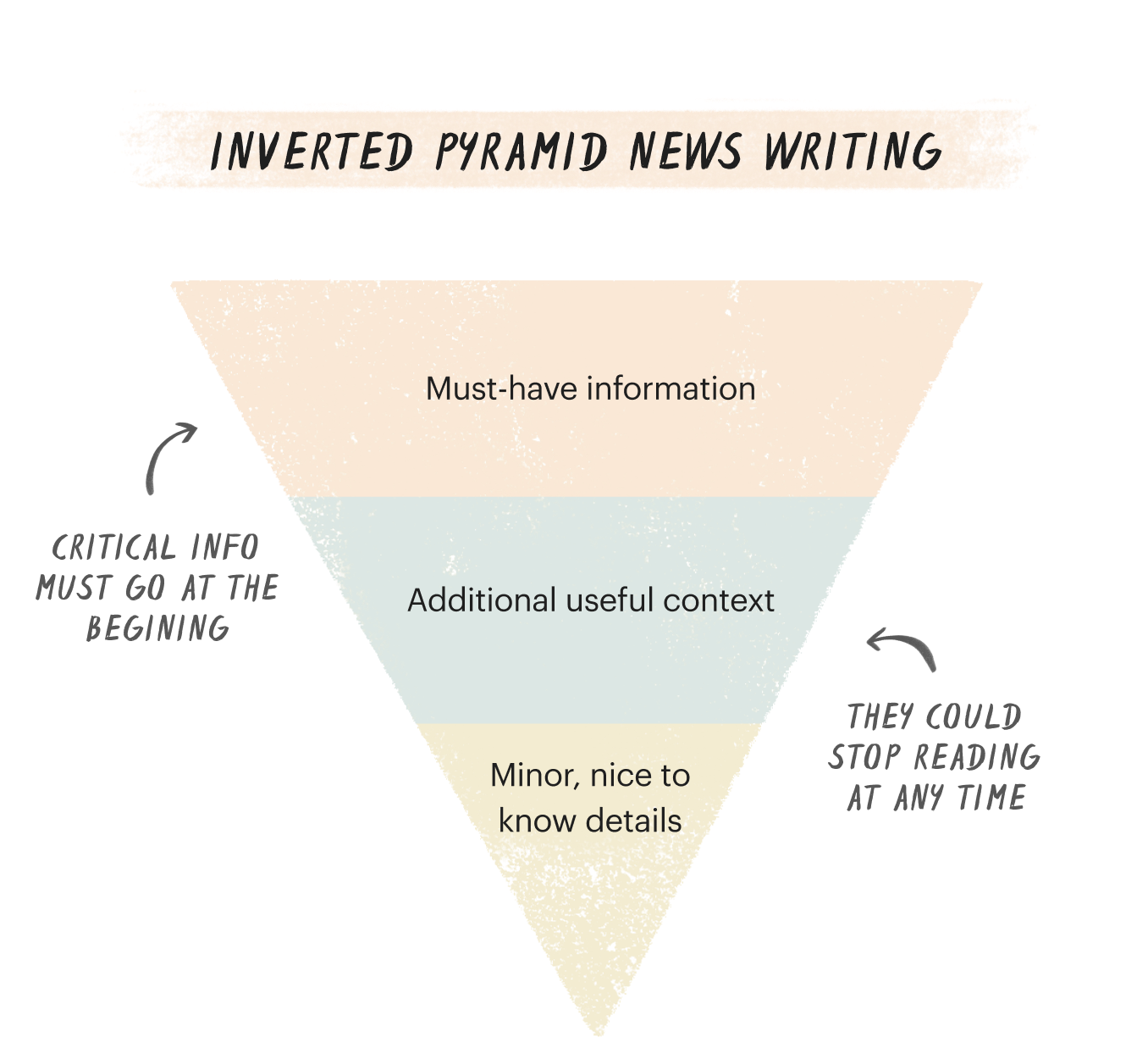
Organizing articles and product interfaces in this way allows readers to get the most crucial details quickly and makes it easier for editors to cut words from the bottom if they’re running out of space. (That will become important in the Say Less section below.)
Sharing results of a campaign? Give an executive summary right at the top. Trying to set up a meeting? Skip the intro paragraph and share your time poll.
Make your call to action prominent and clear
According to studies that track eye movements, people spend the most time on headlines and the first brightly colored button of a website.
That’s why marketing writers typically only include a single call to action (CTA) on a webpage. They often even go a step further, drawing extra attention by placing that CTA on its own line (rather than buried in a paragraph) and using bold or a button to make it stand out even more.
When you’re trying to get a point across or make a request — like asking a coworker to submit a sales report — make sure that request stands out visually. You may not be including a brightly colored button in your emails, but you can make it even easier on your coworkers by having a single, clearly stated CTA in each message, instead of a laundry list of asks that could get lost in the shuffle. Make it easy to pick out by bolding it and placing it on it’s own line instead of burying it in a bigger paragraph. Leave no doubt in your coworkers’ minds as to what you need them to do.

Say less
Once you have your CTA written right at the top, take a cue from the iconic user experience book Don’t Make Me Think by Steve Krug. He argues that the more tools make people think, the less likely they are to actually use the tool.
Krug’s leading solution is simple: Concision. “Get rid of half the words on each page, then get rid of half of what’s left,” writes Krug.
Studies show that people read only 20% of the words they encounter on a given webpage — and if they’re reading on mobile, it’s even less. So distill what you need into as few words as possible. Then get rid of everything else.
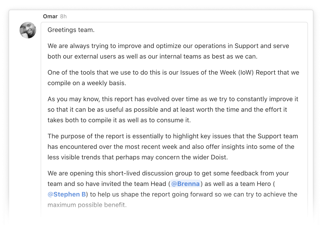
Instead of long, rambling emails that provide a lot of context right away, like this:
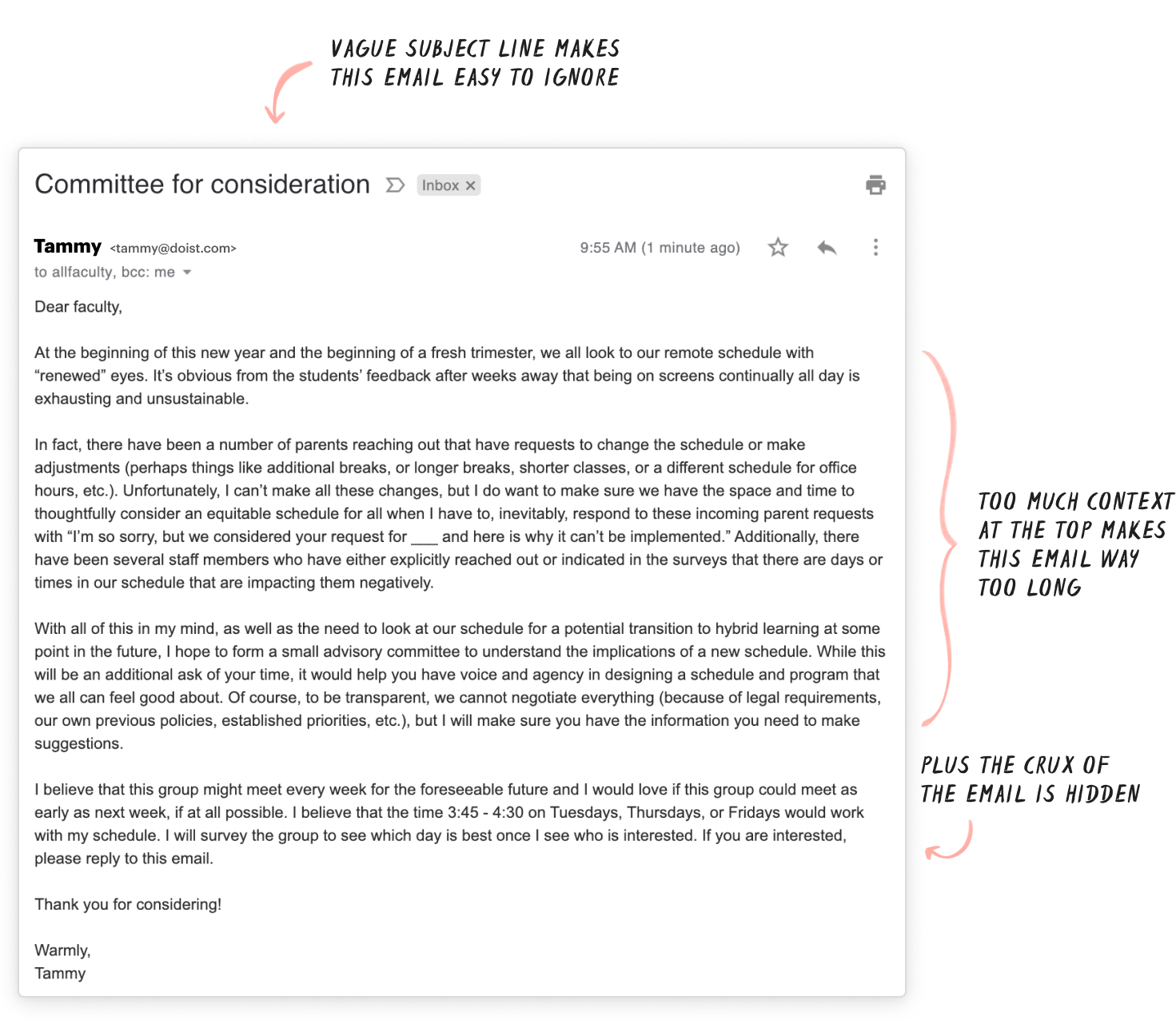
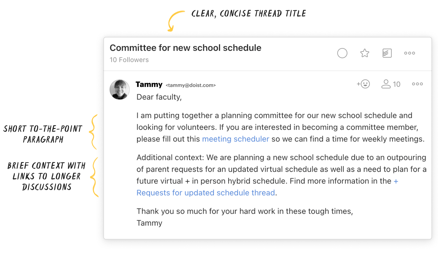
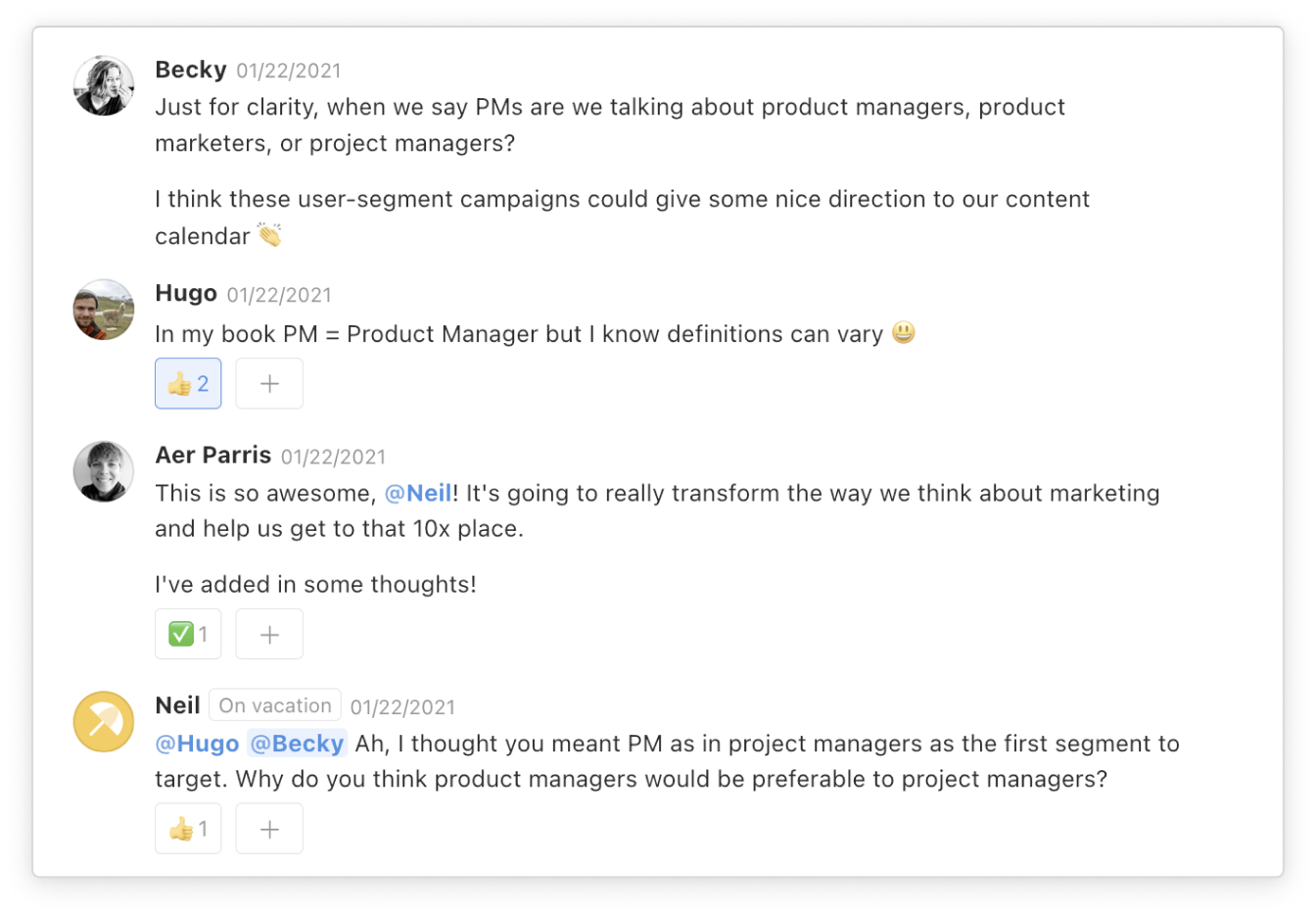
Try editing down the crux, placing it at the top of your message, and providing any necessary context as briefly as possible near the end. Here’s what it looks like in our team’s messaging app Twist:
Make it skimmable
Did you know that people read in an F-pattern on computers? That means they start reading the top line and read less and less as they continue down the page, sticking primarily to a text’s left side.
It turns out that all of us are skimming when we read digitally. That’s why professional writers use headings and subheadings for any writing that needs to be a bit longer — like help center articles, about pages, or getting started instructions. These eye-catching, left-oriented headers help orient readers and direct them to the information they need fast.
Here’s how you can do the same:
- Structure your writing with headings and subheadings, which also helps your coworkers who use screenreaders.
- Use meaningful titles that tell readers precisely what the section is about, rather than clever or vague ones.
- Use descriptive hyperlinks and emphasis (sparingly) so that important words and phrases catch your reader’s eye.
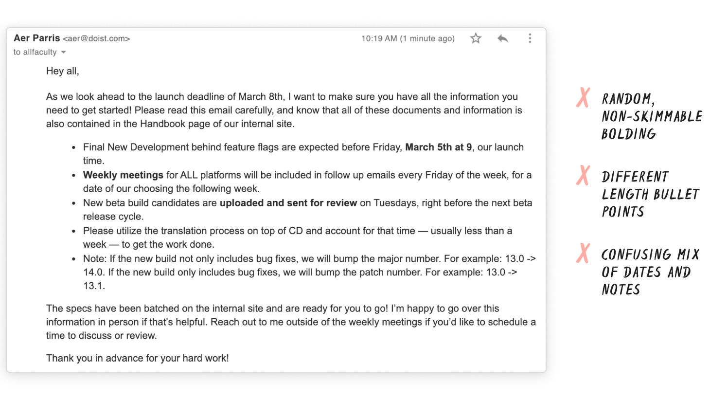
Take the following example. With random bolding, unorganized lists, and a mixture of information, it’s hard to skim the email below to get the main point.
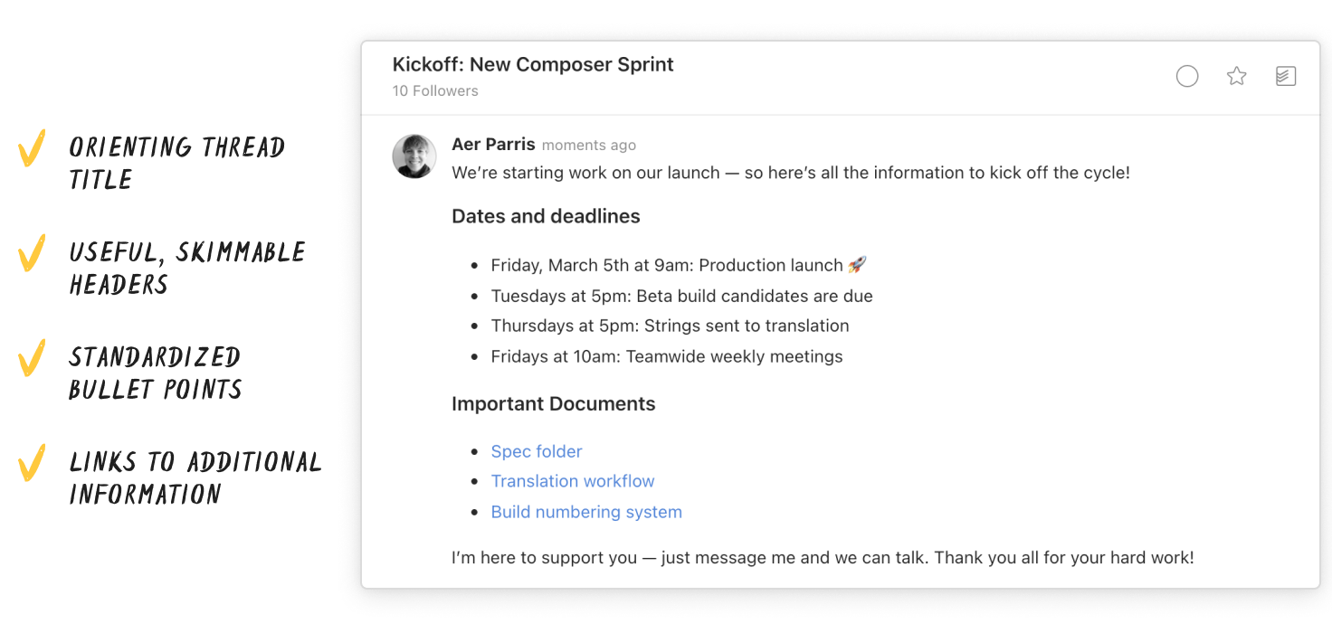
Instead, it’s a good idea to create bullet points of the same length, broken out into skimmable sections, nested under descriptive headlines. As you can see below, Twist makes it easy to include this kind of formatting.
Chunk information for retention
Got the big picture down and edited? Take a cue from writing for accessibility and format your big ideas into scannable chunks.
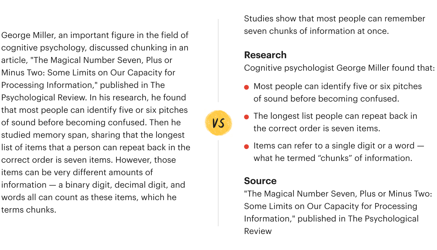
The human brain has limited short-term memory. The average brain holds seven information chunks at a time, which fade from memory in 20 seconds. By breaking content into small units of information (chunking), professional content writers make it easier for users to find and remember important ideas.
You can do the same by:
- Using clear information hierarchies (see the section on headers and subheaders above)
- Grouping related items together
- Keeping paragraphs short (~1-3 sentences)
- Adding white space in between information chunks
Write in plain language
Research shows that accessible design is good for everyone — even people without disabilities. Auto-complete, initially made for people with low dexterity, is now widely used by all. Voice control, implemented for users with disabilities, is convenient for millions. And contrast and color guidelines, created to help people with low vision, help us all see in bright light.
The same is true for writing. Sure, your teammates are smart folks with above average reading levels, but they’re also busy. They don’t have time to parse complicated language and sentence structure.
Professional writers do a few things to simplify their writing and make it more readable for everyone:
- Use short sentences. Lengthy or convoluted phrases strain short-term memory.
- Write in the active voice to make it clear who is taking the action.
- Aim for an 8th-grade reading level, the ability of the average American.
Writing for business is best without flowery metaphors and adjective-filled prose, which can get confusing quickly. Not to mention jargon, acronyms, and made-up words and phrases.
Say 1,000 words, visually
Writers are often told to show, rather than tell. That usually means written descriptions (The clack of the typewriter filled the air as the writer furrowed their brow versus The writer was writing.).
But content creators take this idiom a step further to literally show what they’re talking about. A recent study found that 41% of users watched product videos on e-commerce websites. For these users, that visual content helped them imagine the product in their lives. However, not any video will do. Getting to the point in 30 seconds or less and keeping a slow pace for complicated processes are immensely important for any instructional recording.
Doist designers rely heavily on Loom, a platform that lets you record yourself and your screen simultaneously. It helps them asynchronously communicate without resorting to long walls of text. It’s an incredible tool you can use to:
- Record all types of presentations, from a math class to a business report
- Provide step-by-step instructions, like onboarding a new digital tool
- Offer feedback on specific parts of a product design
“I like recording Loom videos to walk through complicated design concepts that a static mockup wouldn’t communicate clearly enough,” says Doist Designer Stephen Barkan. “It lets me describe things verbally and visually at the same time for my teammates.”
Of course, if you don’t have a video-length amount of information to convey, you can always add annotated screenshots to get your point across. You could even take an example from our annotated screenshots in the sections above — where we draw attention to the subject line and edits by using arrows and brackets.
Research and iterate
Writing isn’t useful if it isn’t read. And good digital writing doesn’t happen in a vacuum through intuition. We’ve seen that marketing and user experience writers are obsessed with research. Take a note from them, and do testing on your own.
Luckily, in a non-professional writing world, that simply means asking the people you’re working with for feedback. Check-ins about clarity and tone can be invaluable.
Then, when you find out that what you’re doing isn’t quite right, try something new.
Good writing may take more time up-front, but pays dividends down the road when everyone can easily reference the information they need to do their jobs well. Using research-proven techniques to explain complex ideas, coordinate work, provide feedback, or simply say thank you, it’s possible to keep everyone in the loop no matter where in the world they happen to be.
After all, we’re all buckling under the weight of thousands of words to be read a day. If every professional used these data-backed writing methods, we’d all win back some precious mental headspace to actually get work done.
Highlight from last week's member thread:
This comment comes from newsletter member Kristin on how she sets async expectations with her clients:
I'm a sole proprietor, but I work with organizations all across the US and Canada and basically train my clients that I function async and they are welcome to do so with me as well while we are working together. In a weird way, I feel like I give each organization a glimpse into how well this can work as we complete projects. Instead of hours of phone calls and meetings, we often can accomplish 80-90% of what we need async. I am very clear up front with clients when we start working about how I work, my alternate hours, and how to contact me.
I am always expecting some cultural pushback from orgs that are used to the standard work schedule or aren't working remotely and it is amazing how quickly they adjust to my async style and most seem to like it. I don't monopolize their time while also getting their work done. The most common question I get is "how much of my time will you need?" when we start projects and they are always a bit shocked when I tell them "As little as possible!" People are so used to endless hours of meetings on these projects and I try to free them from that.
I think the largest learning curve is teaching people not to just pick up the phone and expect to chat all the time. I am a deep-think project worker and those calls are very disruptive. Clients can email and will get a timely response. If they really need to chat, they have my calendar link to schedule my next available call. If it is urgent, I provide a text number so they can alert me. Suddenly what felt like an urgent phone call ends up being a quick email that I respond to and it's done.
My takeaways:
- People are often more receptive to reasonable async work boundaries than you think they'll be. In fact, asking for less of your clients' time in meetings can be an asset!
- Set clear commuication expectations from the get-go including how to get in touch and how quickly to expect a response.
- Have an emergency "release valve" option for truly urgent matters. People will rarely use it, but makes them feel better knowing the option is there.
Kristin shared more about how she sets expectations with clients in a follow up comment.
3 thing worth sharing
- This debugging tip from the author of these brilliant programming zines:
debugging strategy: write a message asking for help pic.twitter.com/5Ijxpsehcy
— 🔎Julia Evans🔍 (@b0rk) July 12, 2022
- You don't need Slack. You need slack. An article from newsletter member and Agile expert Sumeet Moghe on why operating at 100% capacity maintains the status quo:
Here’s a hard truth about change. There are no magic bullets. Teams are systems and after a spell of being together, they build an equilibrium. Ways of working, good, bad or ugly, are part of that equilibrium. Every change will disrupt that equilibrium and a period of chaos will ensue. Velocity will invariably take a hit. If you don’t plan for this period of chaos, you’ll overweight the status quo compared to the change. Often, this is where the team abandons changes.
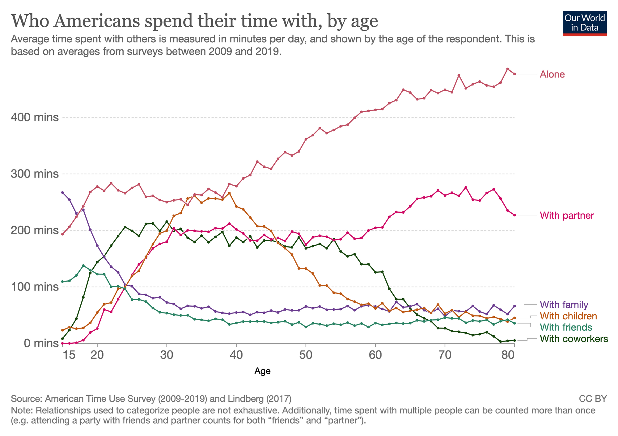
- A fascinating visualization of who Americans spend their time with. My coworker Naomi shared it with this message:
I’m convinced that working async would have a positive impact on this. Less time with coworkers and more time with friends and family. Thought you might like this little thought experiment.
How you spend you time is how you live your life...
What’s Twist? Twist is an async messaging app for teams burned out by real-time chat, meetings, and email.
You don’t need to use Twist to get a ton of value out of this newsletter and community. But if the topics we talk about resonate with you, there’s a good chance the app will too. See what makes Twist different →
🌎 Built asynchronously by the fully remote team at Doist
